I finally got back to this problem and got my head around how to make the sidebar-1 modules disappear in the Blog menu as per the other menu items. In the Module Class Suffix option (Advanced tab of the Module settings) I added " hidden-sm hidden-xs". Previously this option only had " hidden-xs", where the modules for the other menu items had both.
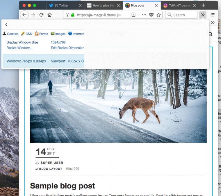
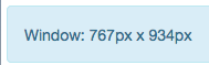
So that fixed that problem. However, if you look at the attached screenshots of the Home page and the Blog you'll see there's still a big gap on the right - I've attached a screenshot of the screensize, too.
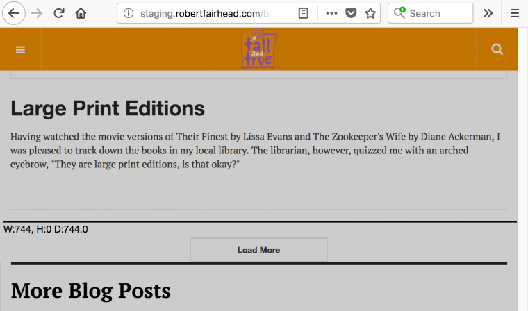
If I drag in the screensize of the Blog, the gap disappears and the content fills the screen nicely, as per the 2nd batch of screenshots (marked "-2") and as per the Home page. This must be a CSS or some other setting but I can't find it, hence I raised this support forum post in the first instance.
Finally, I have also tried adjusting the Responsive Layout settings in Template Styles, but this didn't work.
Hopefully this helps you suggest an answer to my problem.
Regards,
Robertf
Screensize:
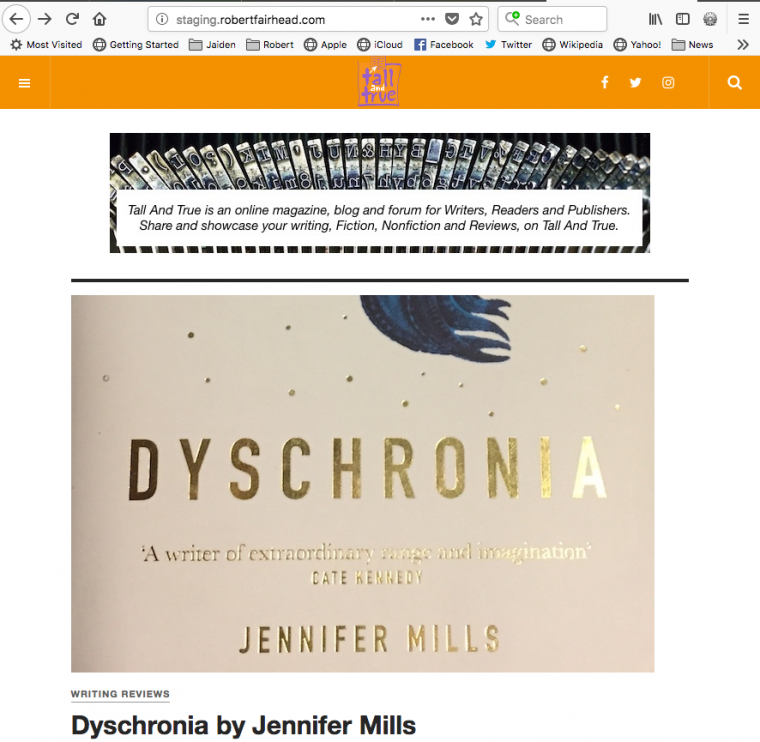
Home page (and other menu items):
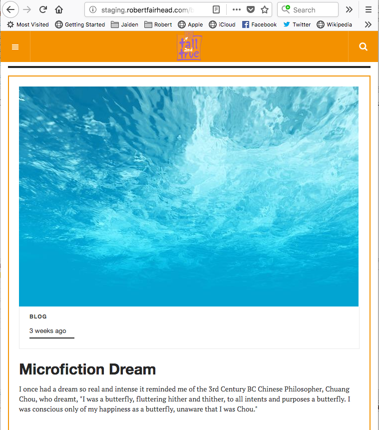
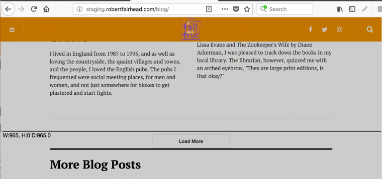
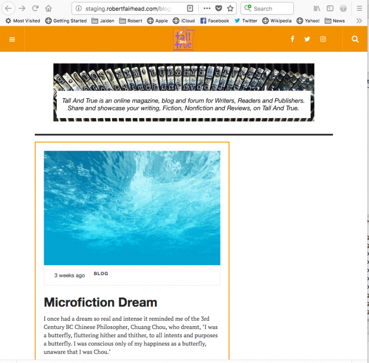
Blog menu item with gap on right hand side (I want it to fill screen like the Home page):
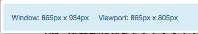
Screensize-2 (slightly smaller than 1st screensize):
Blog menu item with NO gap: