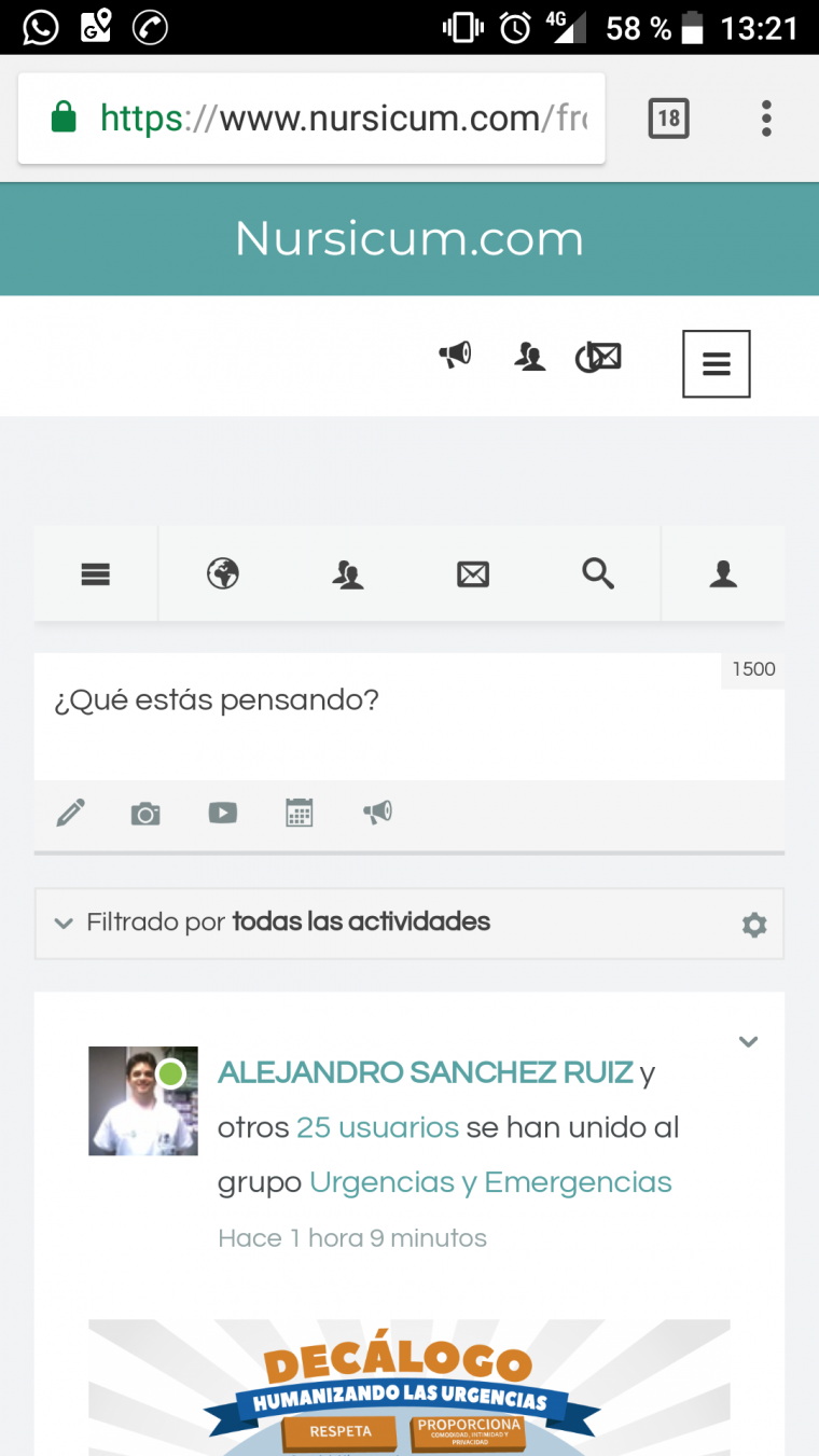
Hi,
I detected that in mobile view there is a small bug with top menu items that are not correctly aligned.
I attached an image with it.
Thanks,
Hi turminator
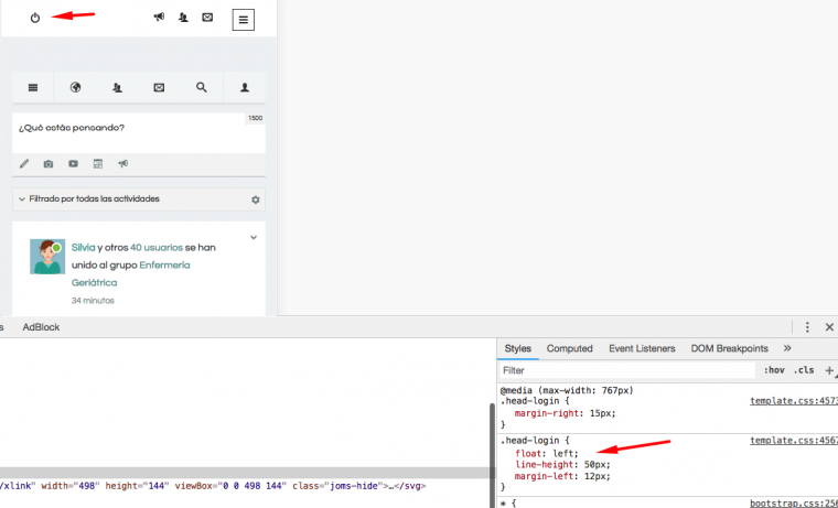
Try to add to your custom.css this code ( if you don't have it already then create a new one in this folder /templates/ja_social_II/css/ )
@media (max-width: 767px) {
head-login {
float:left!important;
 }
}
Regards
Hi pavit,
I tried to add this in my root template but when I tested with my mobile device it continues showing wrong.
Thanks for your support,
turminator Hi Sorry there an syntax error in last code. Kindly use this code
@media (max-width: 767px) { .head-login { float:left!important; } }
Save and check.
I tried to do this modification but it continue showing the same error.
turminator I tried to do this modification but it continue showing the same error.
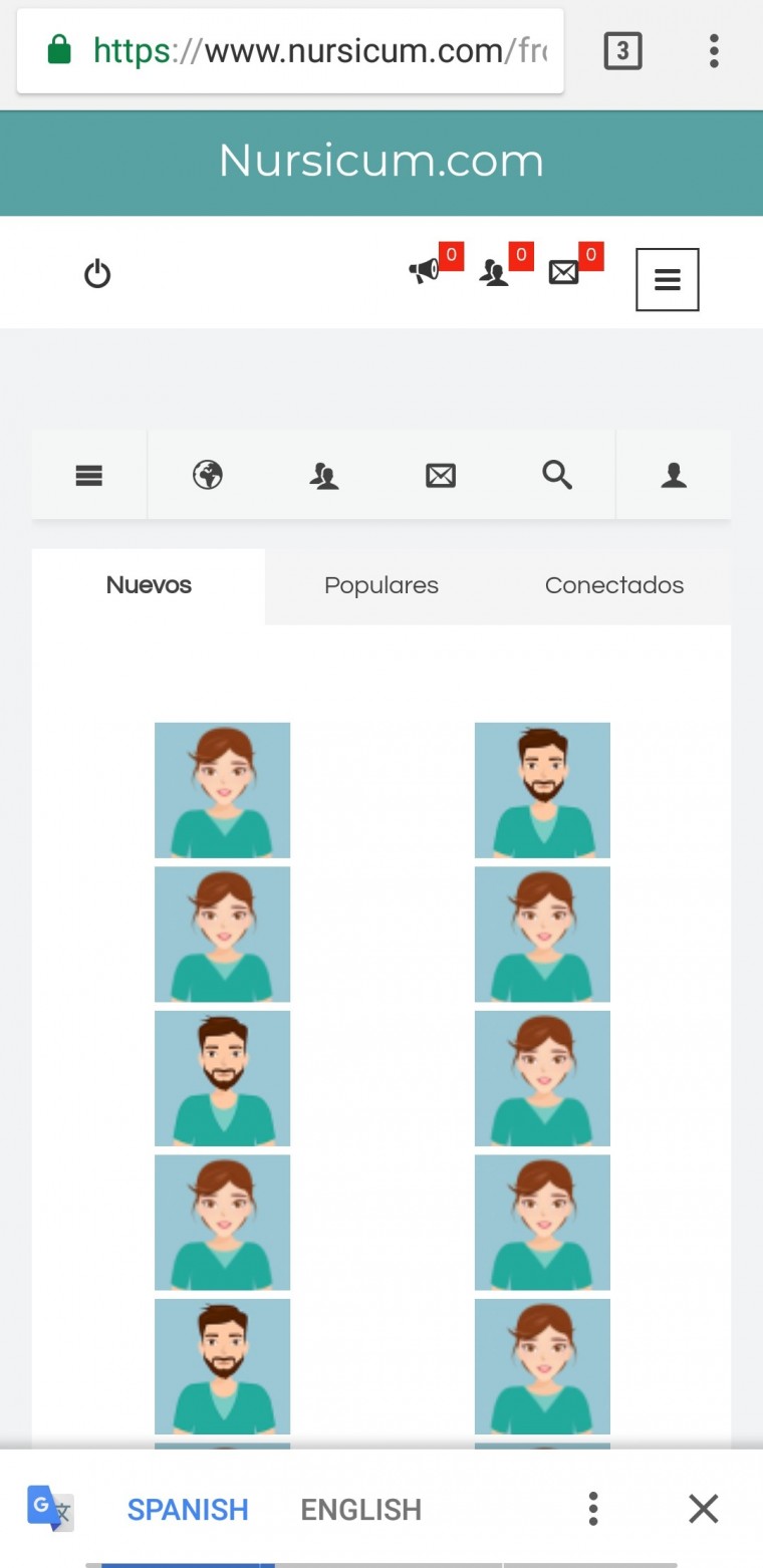
Appears fine now for me in responsive screen size in real-time. Kindly view screenshot attached